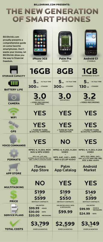
 Usable charts are awesome. I’ve seen many funky charts out there from people who wanted to display data. I’ve been hearing ads for BillShrink.com. At first I thought it was a guy named Bill Shrink until I made it to the address. This site is a great example of how to map/compare products. One of the problems that I see in charting is the lack of direction and purpose of the chart.
Here are some key things you need to think about when making a chart:
- Remember your target audience
- Compare the relevant information
- Keep the units of measure the same (don’t use inches and centimeters on the same chart)
- Summarize
- Use color/bold/italics when possible
Your job when making a chart is to make it easier to read for people. You might want to dummify your chart if you don’t know your target audience. Making it simple doesn’t mean you don’t know what you are talking about. Think about some of those product sites when they ask you to compare products. Some sites give you way too much information or information that means nothing.
If you have that need to put as much information out there, make a legend of what these things mean. Again, think about your target audience.
What does this have to do with the iPhone, Pre, and Android? One of the things that Bill Shrink does well is give you the bottom dollar. What is this going to cost at the end of the year? Look at the chart. Makes it simple, right?
What would I buy? At first, without looking at the chart, I ranked them as iPhone, Android, and Pre. After looking at the chart-iPhone, Android, and Pre. I’ve totally written off the Pre. I’m tired of dealing with Palm. Palm hasn’t kept up with cool features and I think has lost most of their development support. Palm devices were a great tool when compared with what was out there (I’ve had at least 4 Palm devices and software).
Android does the job and will do many other jobs for you. Android would be my first choice if I was still using my paper planners and didn’t know better. I love the iPhone mainly because of iTunes. The chart highlights one of the things I don’t like about the iPhone–multitasking. After being on an iPhone for about a year now I can live without the multitasking.
Use the chart if you’re concerned with the dollar amount at the end of the year. These are hard economic times, right?
References:
http://www.billshrink.com/blog/


