

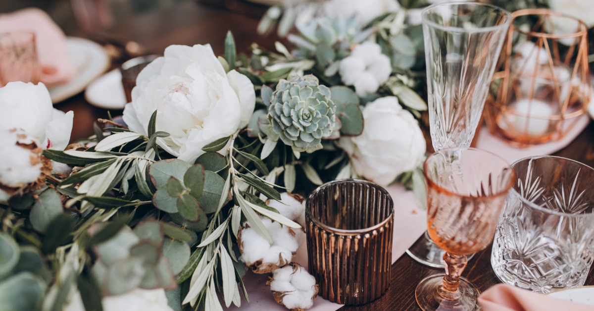
Color sets the mood long before guests notice the flowers or table settings. Warm shades can make a room feel inviting, while cooler hues can bring a softer sense of contrast. If you like both sides of the color wheel, you don’t have to choose one direction. Mixing warm and cool tones in wedding décor can create a layered palette that feels natural when each shade has a clear place.
The goal is balance. Too many competing colors can make the room feel busy, while a palette that’s too strict may come across as flat. Giving each shade some breathing room helps the full look come together without feeling overly planned.
Start With One Dominant Temperature
It’s usually easier to build a balanced palette when one side leads. Decide whether you want the overall mood to lean warm or cool, and use the opposite temperature for contrast.
A warm base might include terracotta or soft gold across larger décor pieces. Cooler accents such as dusty blue can break up that warmth without changing the mood. If you’d rather start with cool tones, slate blue could carry the larger elements while copper or peach brings in warmth.
This gives the room a clear visual direction without making every detail match.
Use the Venue as Part of the Palette
Your venue already brings color into the space. Wood floors or painted walls can change how your wedding colors look once everything comes together.
A venue with honey-toned wood may already feel warm, which gives you room to bring in cooler florals or blue-gray textiles. A space with gray walls or concrete floors may benefit from warmer candlelight and amber-toned details.
Natural light matters too. Bright daylight can make cooler shades look crisper, while evening light often pulls out warmer undertones. If you can, look at fabric swatches and floral samples at the venue instead of choosing every shade from a screen.
Let Neutrals Connect Both Sides
Neutrals can help warm and cool colors sit comfortably next to each other. Cream can soften a strong blue, while taupe can work well beside muted rose or sage.
Rather than treating neutral shades as filler, give them a real role in the design. Table linens or ceremony backdrops can carry a softer neutral that keeps richer colors from competing.
A neutral base also gives you a little more freedom later. Flowers can vary with seasonal availability, and the broader palette can still feel cohesive.
Choose Color Roles Before You Shop
It helps to decide where each color will show up before you start buying décor. You don’t need a rigid formula, though a simple plan can keep the palette from creeping onto every surface.
A few guidelines can help:
- Use the dominant temperature on larger surfaces such as linens or draping.
- Bring the contrasting temperature into flowers or paper details.
- Keep metallic finishes consistent across most of the room.
- Repeat one accent shade in a few visible places for continuity.
These roles can stay flexible. They’re there to make later decisions easier, not lock you into a strict design plan.
Carry the Palette Into the Wedding Party
Décor doesn’t exist separately from clothing. Bridesmaid dresses and suits appear throughout the day, which makes them part of the visual story too.
Fabric reacts to light differently than flowers or paper. Allure Bridals notes how warmer champagne hues create a different effect from cooler platinum shades.
If you’re picturing the bridal party look of your dreams, the wedding party can echo the room without copying it. A cool blue bridesmaid dress can sit beautifully beside warmer floral arrangements when another detail helps connect the two.
Pay Attention to Undertones
Two colors can look like a good match on a mood board and feel different once you see them together in person.
A beige with a yellow undertone will read warmer than one with a gray base. Pink can shift in the same way, and metallic finishes can pull a palette warmer or cooler depending on their finish.
Looking at samples side by side makes those differences easier to spot before the wedding day. Printed materials deserve the same attention because colors on a screen don’t always translate cleanly to paper. Requesting a proof can give you a much better sense of how the finished invitation or place card will look.
Use Flowers to Bridge the Palette
Flowers make it easier to connect warm and cool tones because arrangements naturally include subtle color variation. A florist can use one softer shade to bridge stronger colors, especially if you’re working with muted tones.
Greenery can help too. Some greens lean blue, while others have a warmer yellow cast. The right foliage can make an arrangement feel connected to the rest of the décor without calling attention to itself.
Choosing colors with personal meaning can also make the design feel less tied to seasonal trends. Small details that feel specific to the couple often give a more personal wedding a stronger sense of character without changing the whole palette.
Keep Metallics From Taking Over
Metallic finishes can shift the temperature of a palette quickly. Gold and brass tend to add warmth, while silver and chrome usually feel cooler.
Mixing finishes can work, though too many can make the room feel scattered. Choose one main finish and repeat it where it makes sense, such as on candleholders or table numbers. If you bring in a second metal, keep it quieter.
Lighting can change how those finishes read as well. Warm bulbs can soften silver, while bright white light can make gold look sharper.
Make the Contrast Feel Intentional
Warm and cool tones work best when the contrast has a purpose. Warm shades can draw the eye toward a focal area, while cooler colors can settle the surrounding space.
It’s worth stepping back from individual swatches and looking at the full setting. Décor will appear beside attire in photos, even if you chose those pieces at different points in the planning process. Looking at them together can show you where the palette feels balanced and where one shade may need to pull back.
Build a Palette That Feels Like You
There’s no single formula for mixing warm and cool tones throughout wedding décor. You might prefer a mostly warm room with a quiet blue accent. You may lean toward cooler shades and bring in touches of peach or brass for contrast.
The strongest palettes feel connected without looking overworked. Give your colors clear roles and pay attention to their undertones. Let the venue influence the final balance, and keep enough flexibility for the look to feel natural once everything comes together.